
Code&Data Insights
[Tableau Desktop Specialist Certification] Exam Prep - Domain 2 : Exploring & Analyzing Data (중요 내용 정리) 본문
[Tableau Desktop Specialist Certification] Exam Prep - Domain 2 : Exploring & Analyzing Data (중요 내용 정리)
paka_corn 2023. 8. 28. 07:51[ Domain 2: Exploring & Analyzing Data ]
2.1 Create basic charts
1) Create a bar chart

bar 차트의 종류
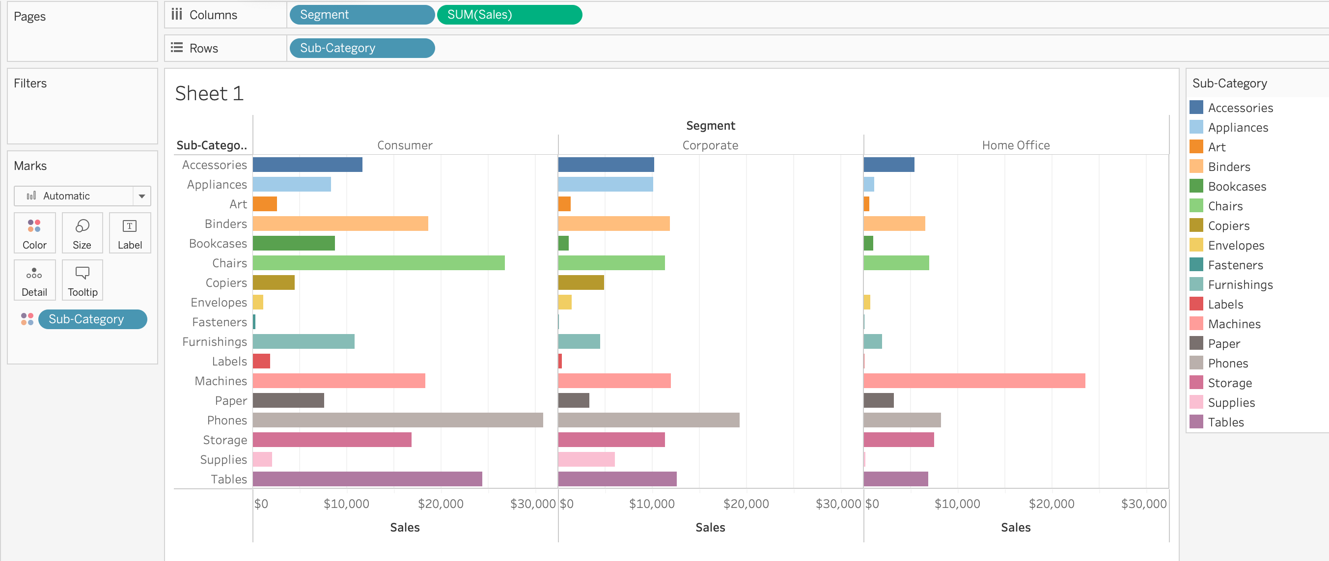
- horizontal / stacked / side-by-side bars

headers : Sub-Catergory
sales : axis
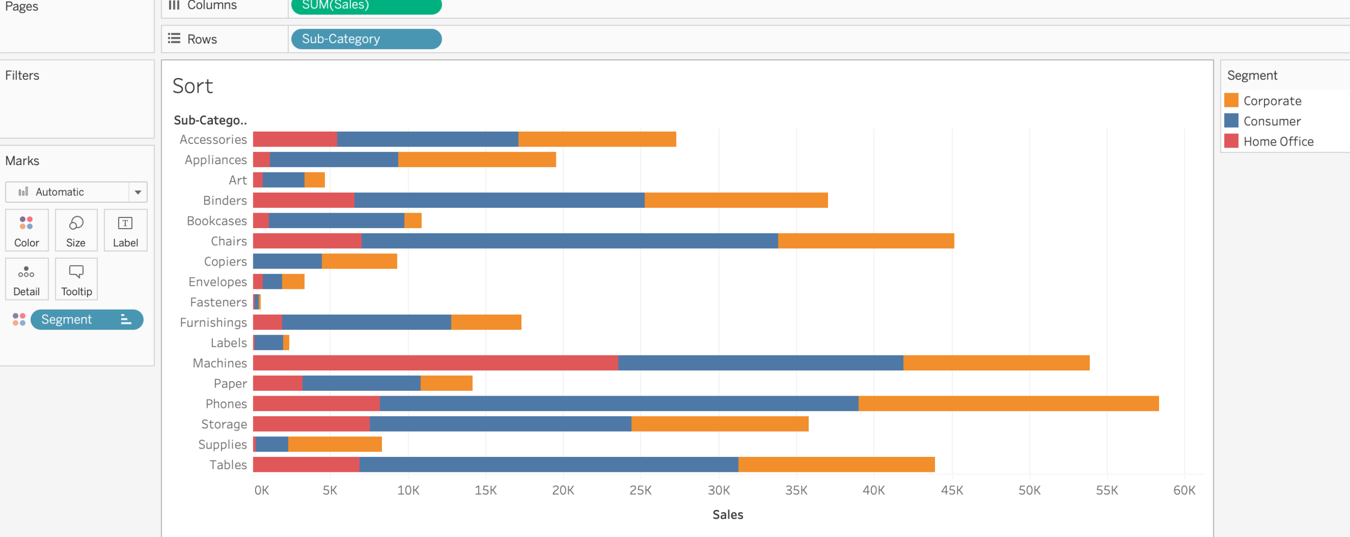
A stacked bar
- by adding a second dimension('segment') to view creates a stacked bar
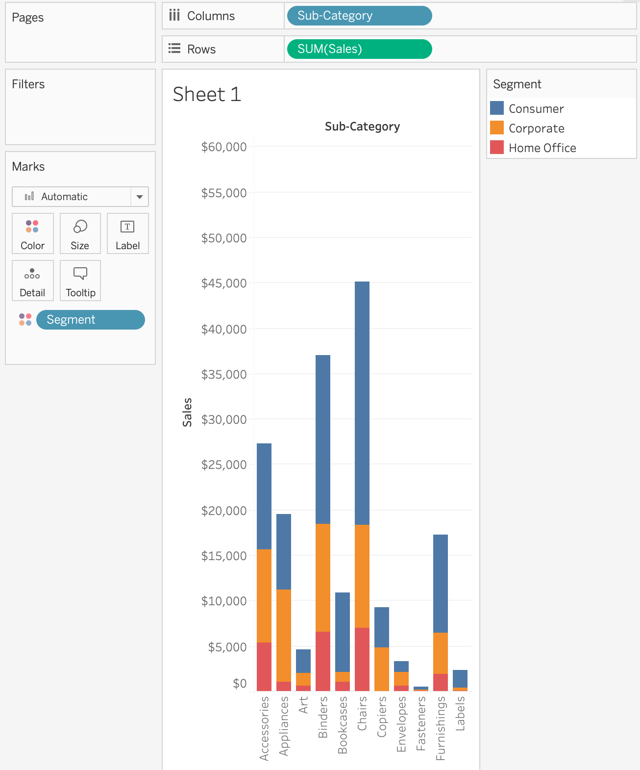
A side-by-side bar
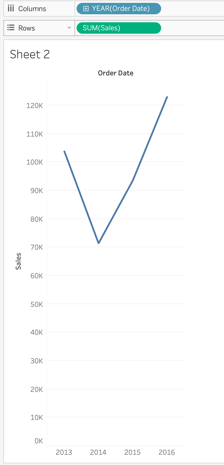
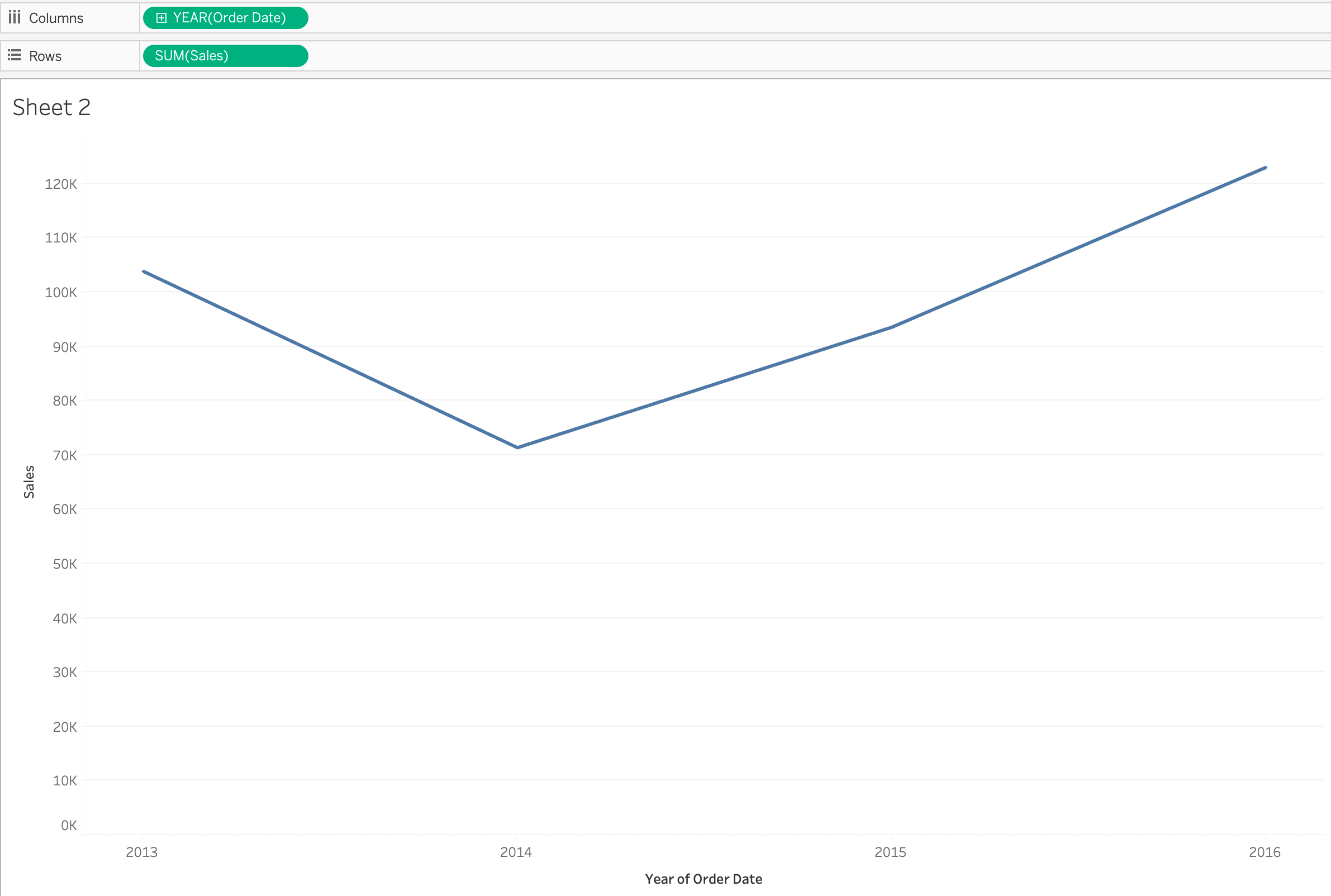
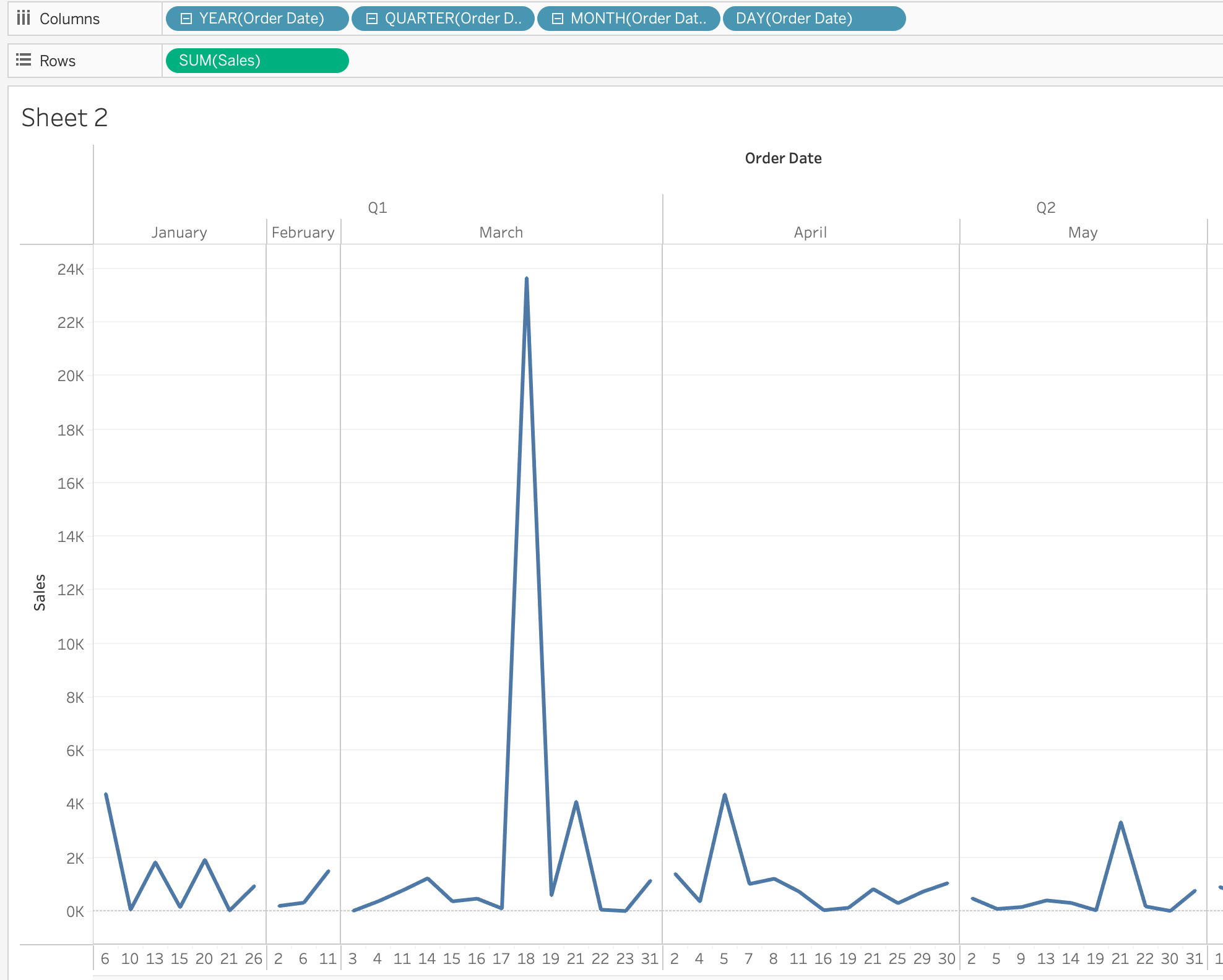
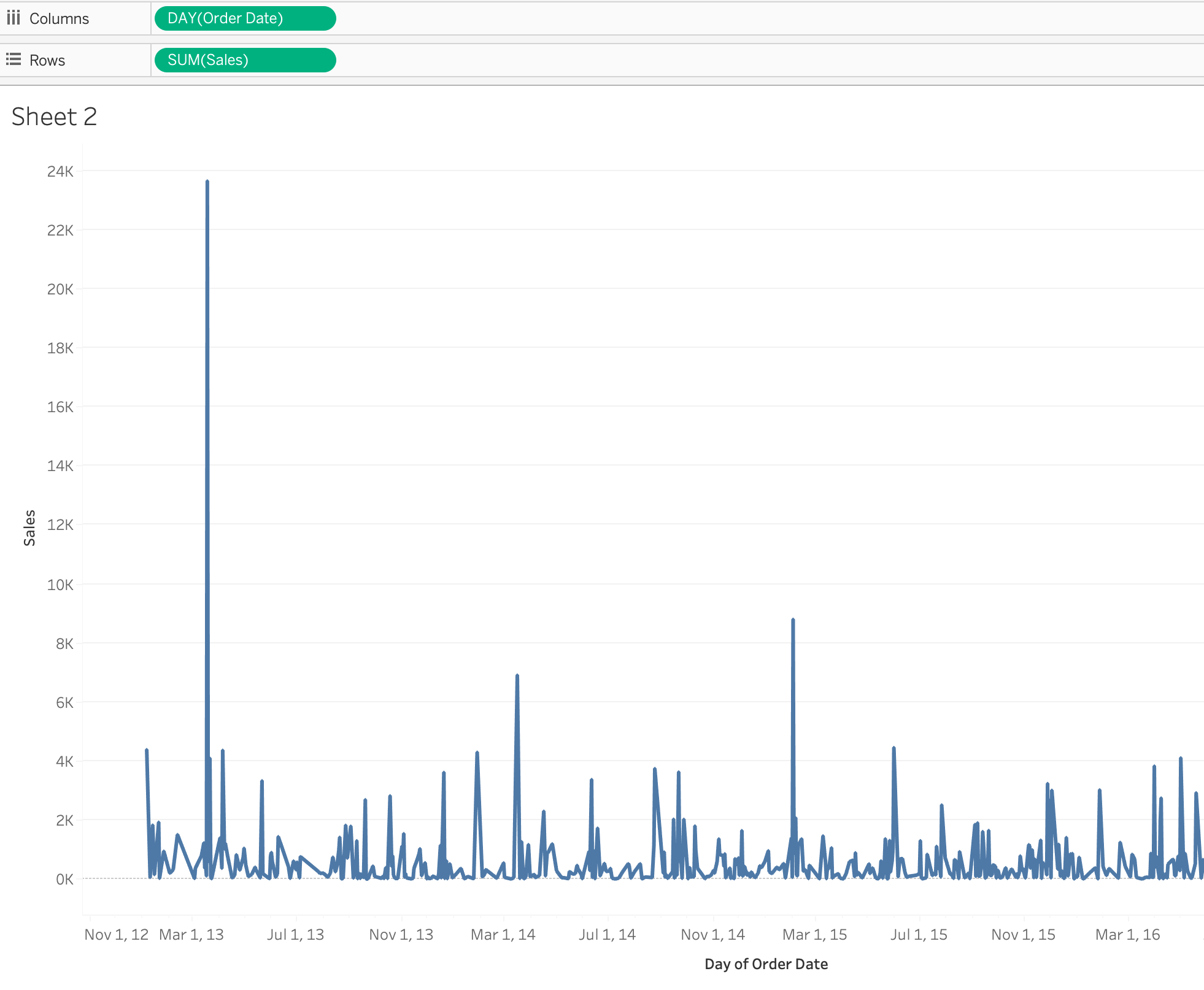
2) Create a line chart
** Line charts always involve a date dimension.
line chart의 종류 - discrete / continuous lines
=> discrete fields create headers ( blue : YEAR(Order Date)
=> continuous fields, create an axes instead of headers
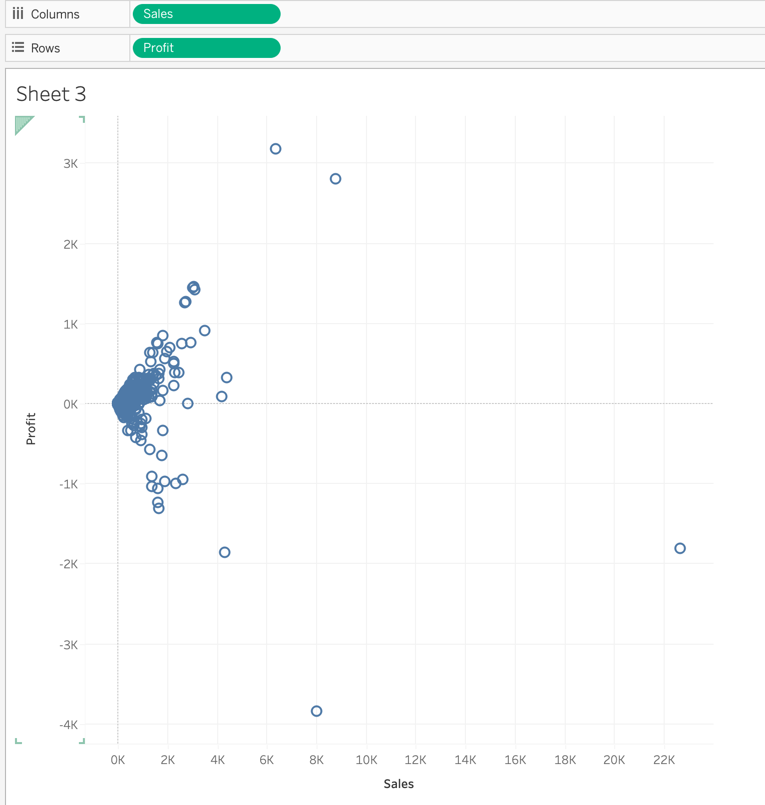
3) Create a scatterplot
- Scatter plots allow us to visualize the relationship between two or more measures
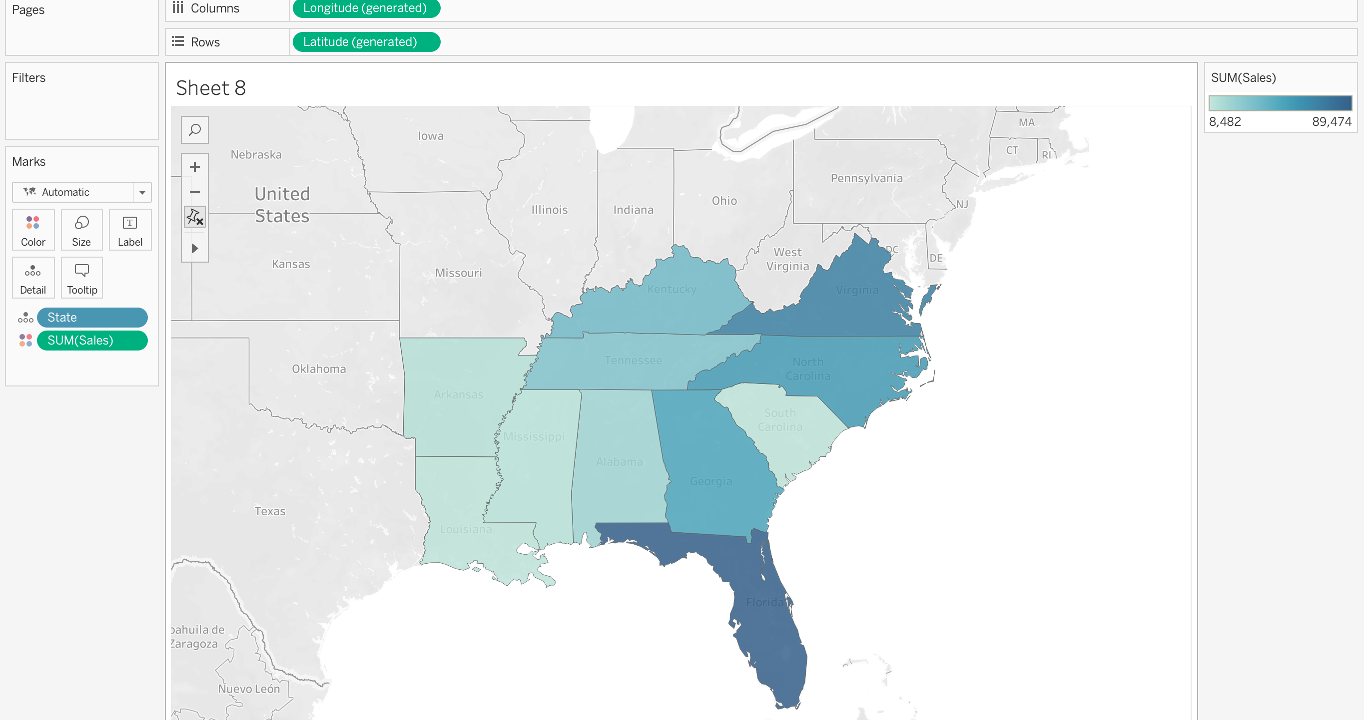
4) Create a map using geographic data
- when the same city exist in different states, we must add include 'state' in the view
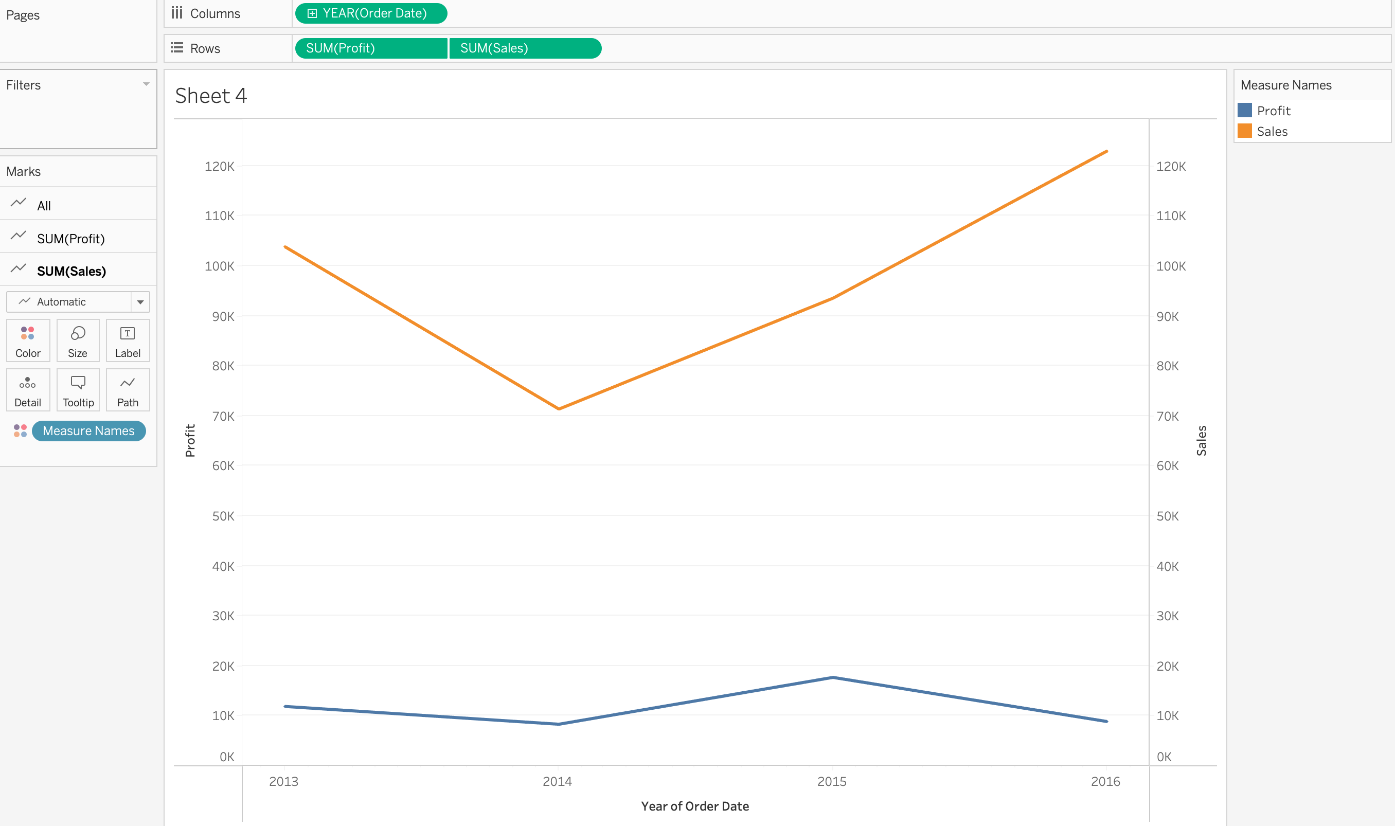
5) Create a combined axis chart
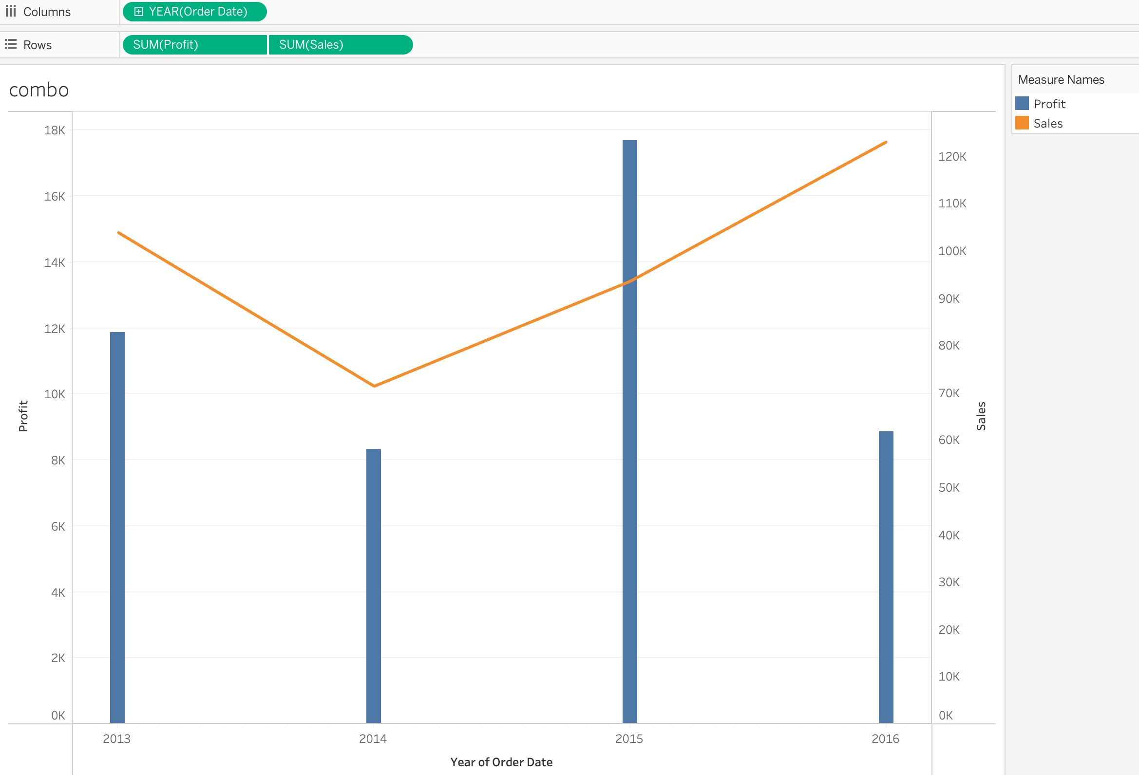
6) Create a dual axis chart
- dual line : two measures & one date
- dual line chart shows two different measures changing a date range
7) Create a stacked bar
8) Create a density map
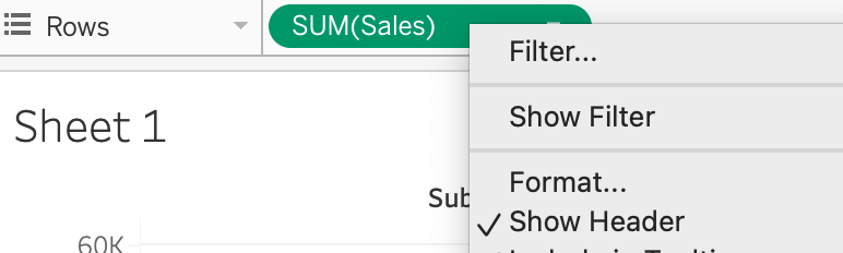
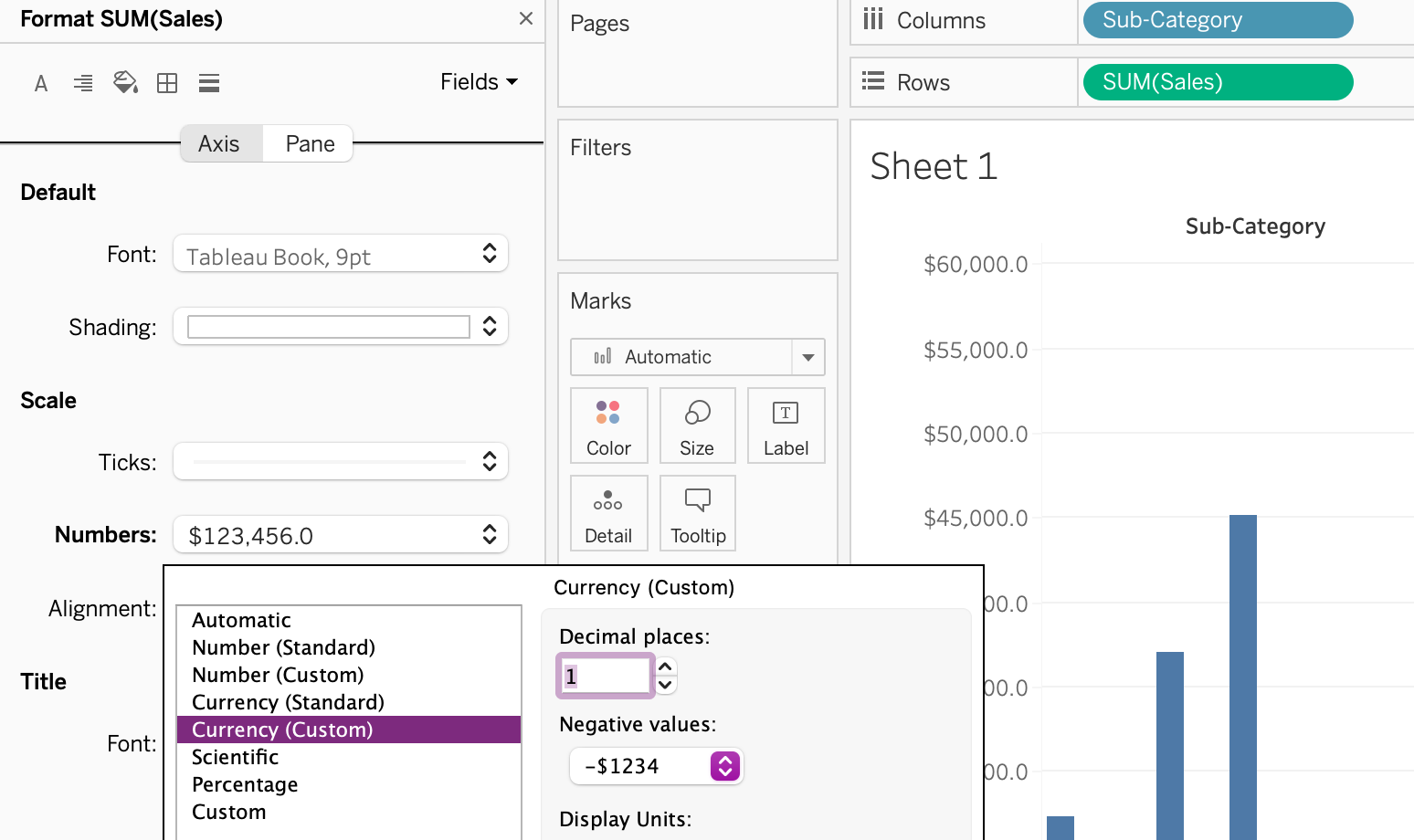
9) Create a chart to show specific values (crosstab, highlight table)
Crosstab : a term that means text table
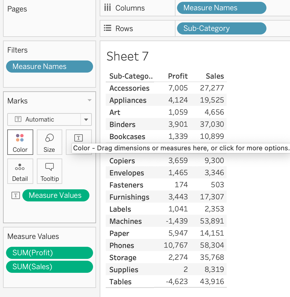
Highlight table : a crosstab with a color gradient for the measure

=> A highlight table is represents a measure using color.
2.2 Organize data and apply filters
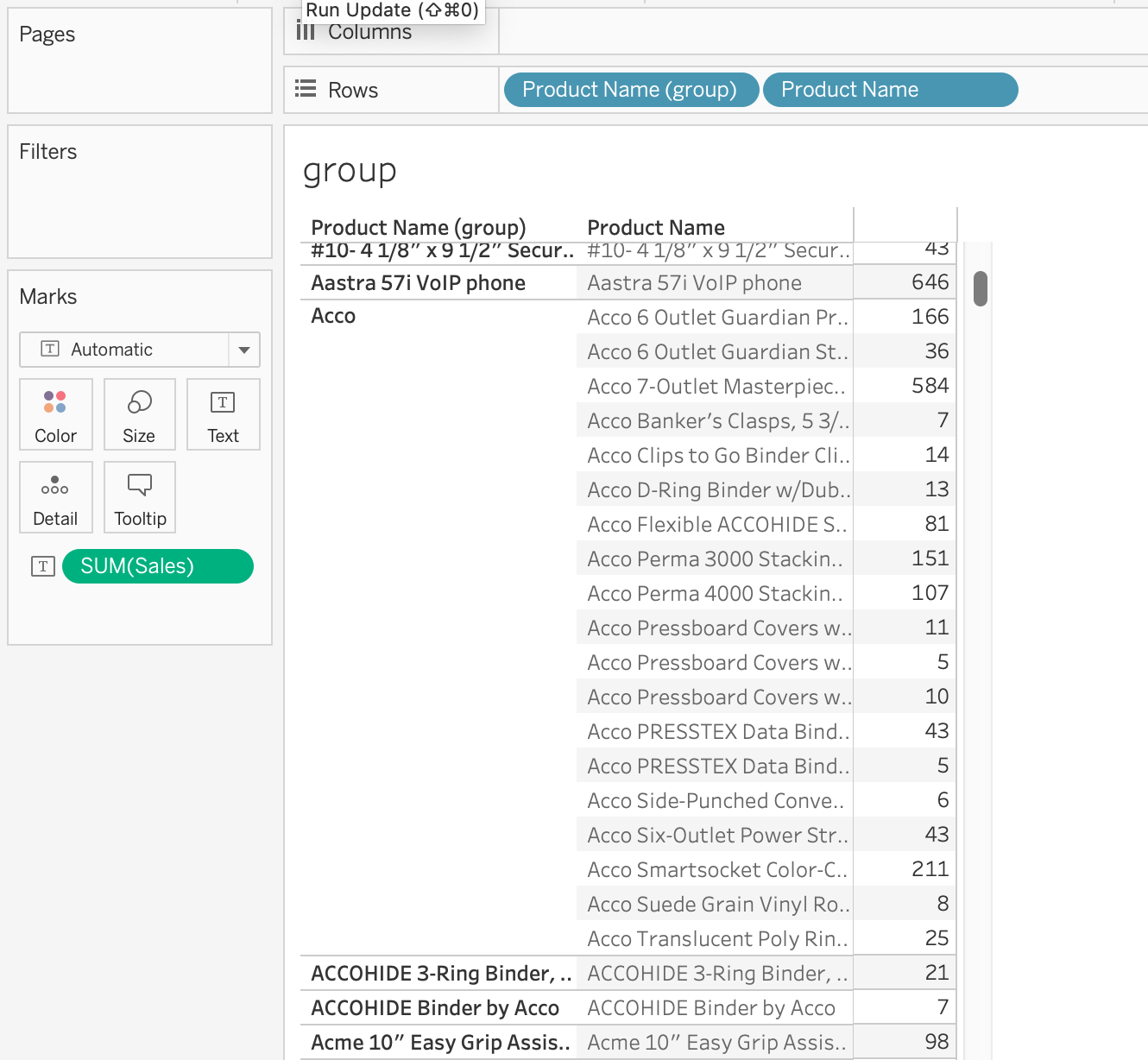
1) Create groups by using marks, headers, and the data pane
- Groups
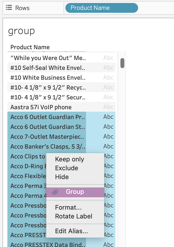
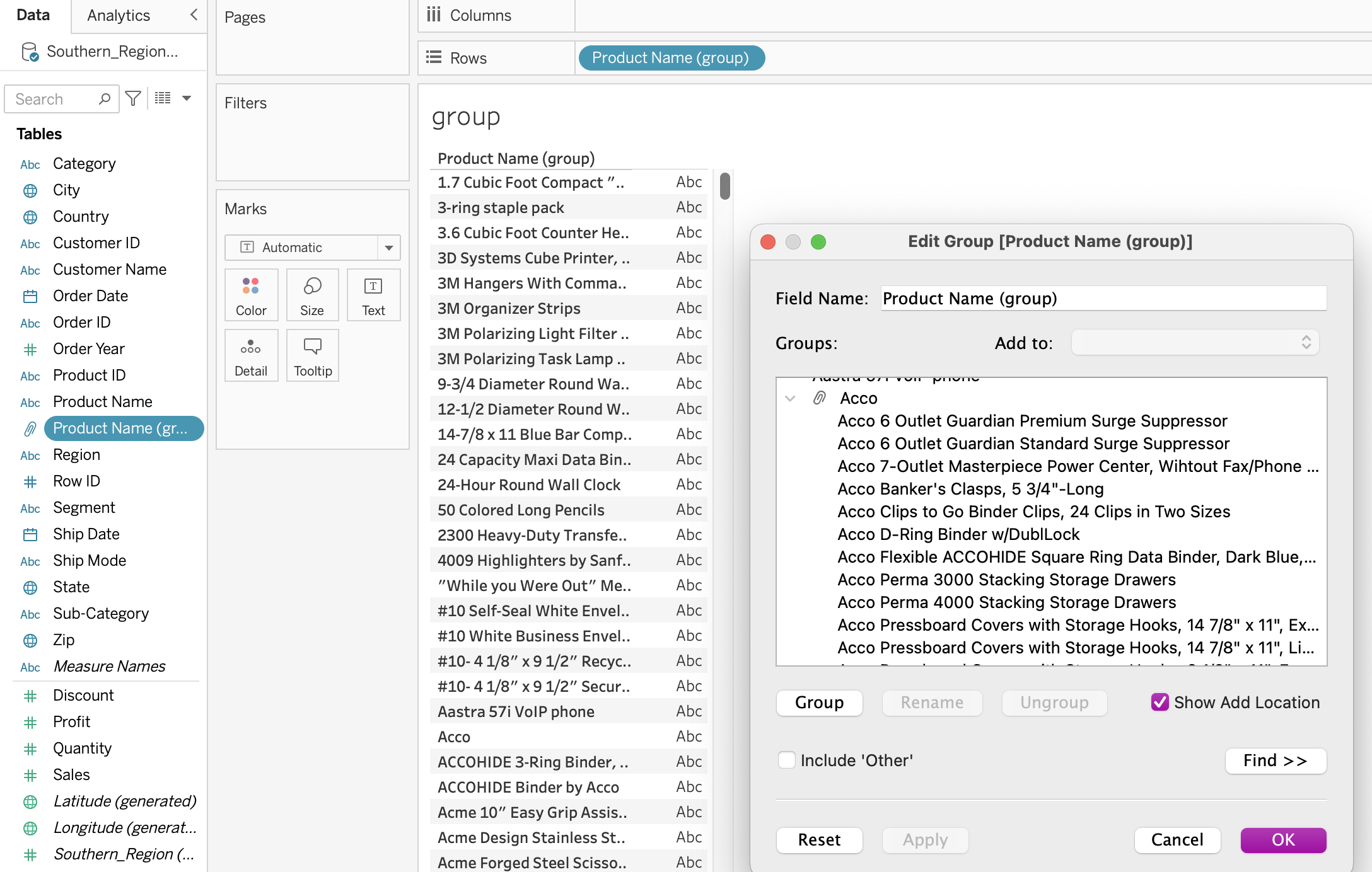
각각 마우스로 그룹을 만들거나
'Edit Group'에서 그룹핑할 수 있음
만들어진 그룹으로
group by나 따로 분류해서 보는 것이
가능
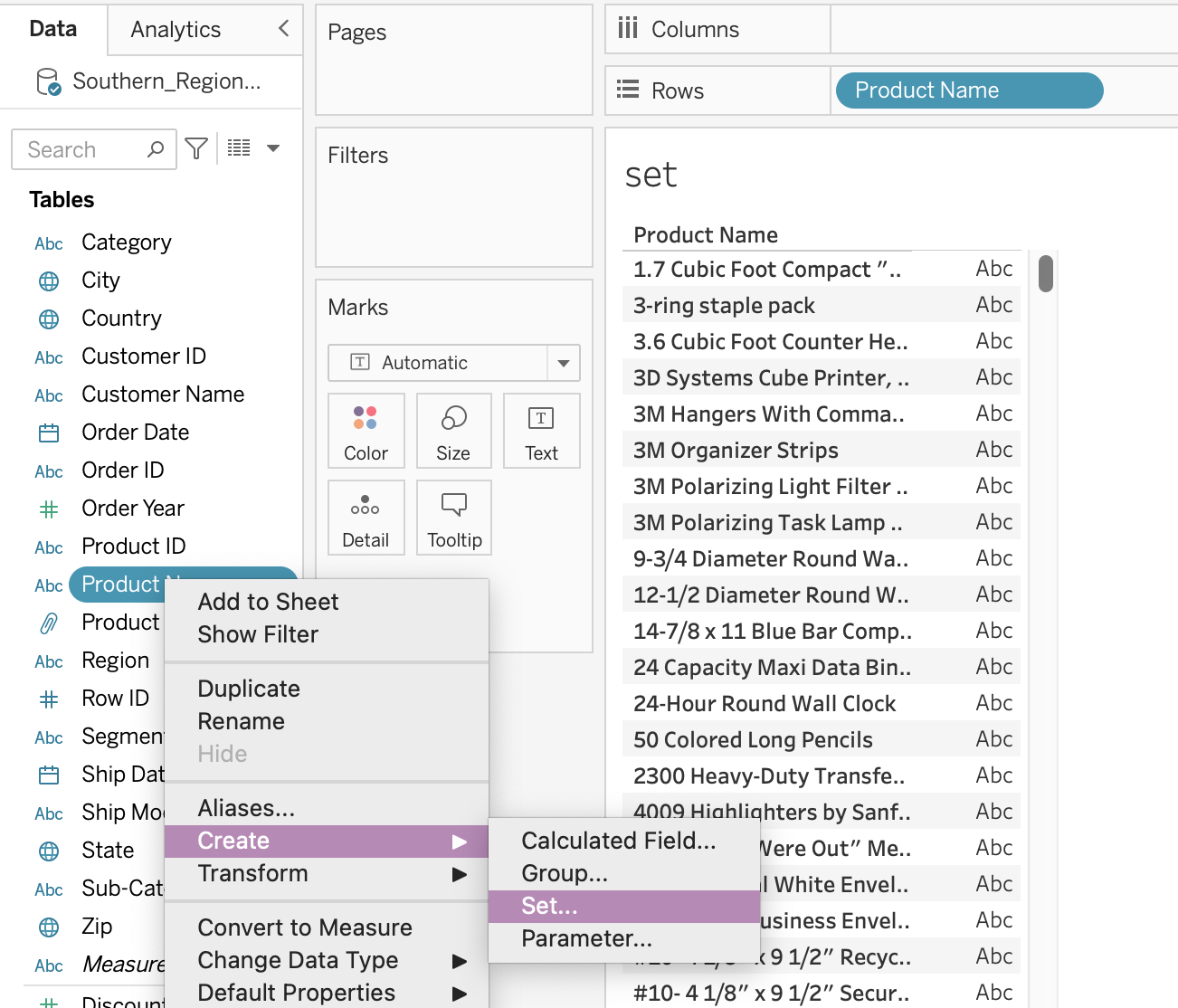
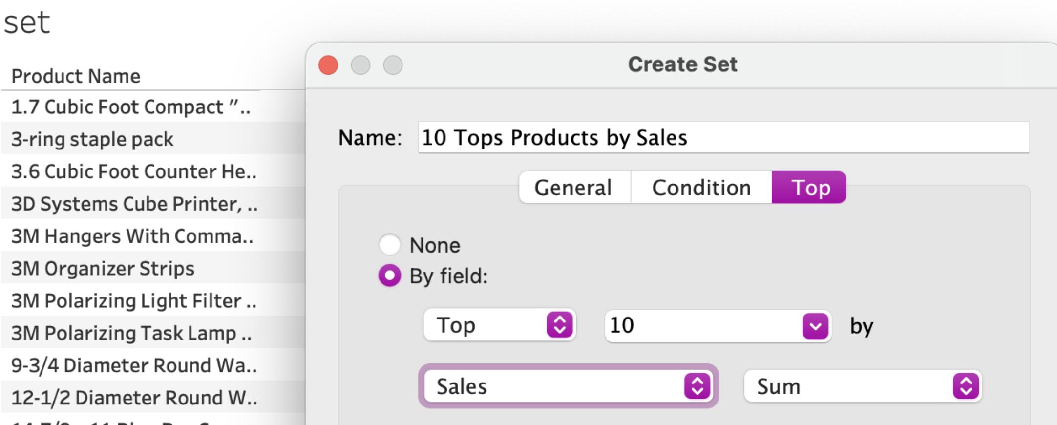
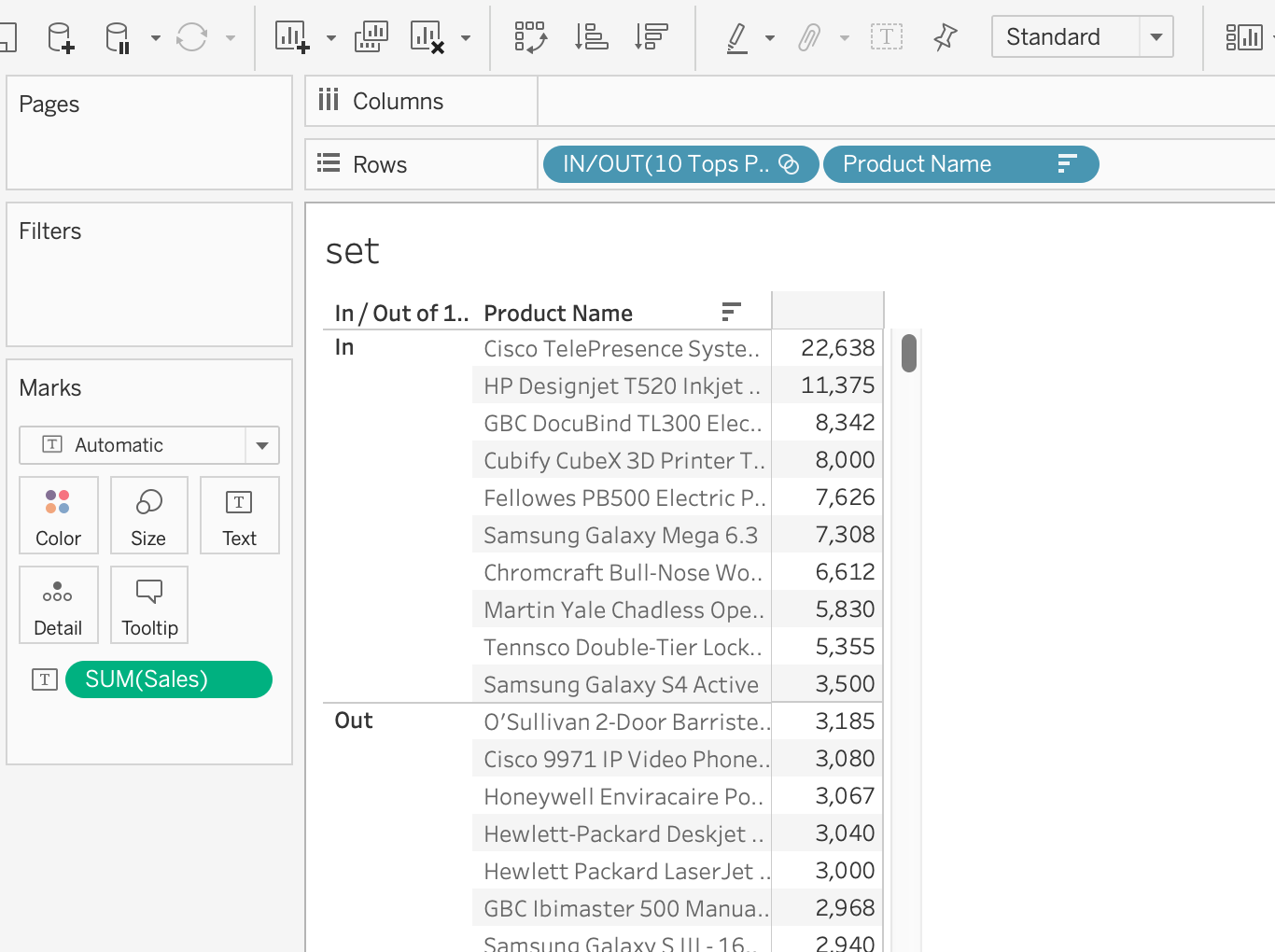
2) Create sets by using marks and the data pane
- Sets
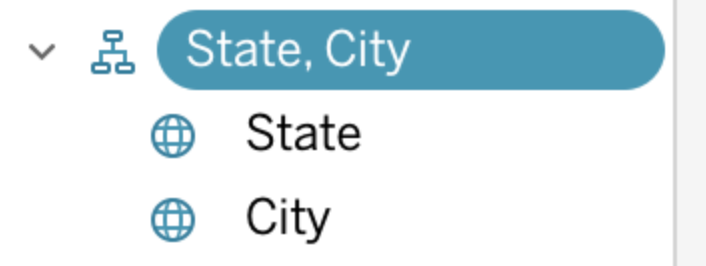
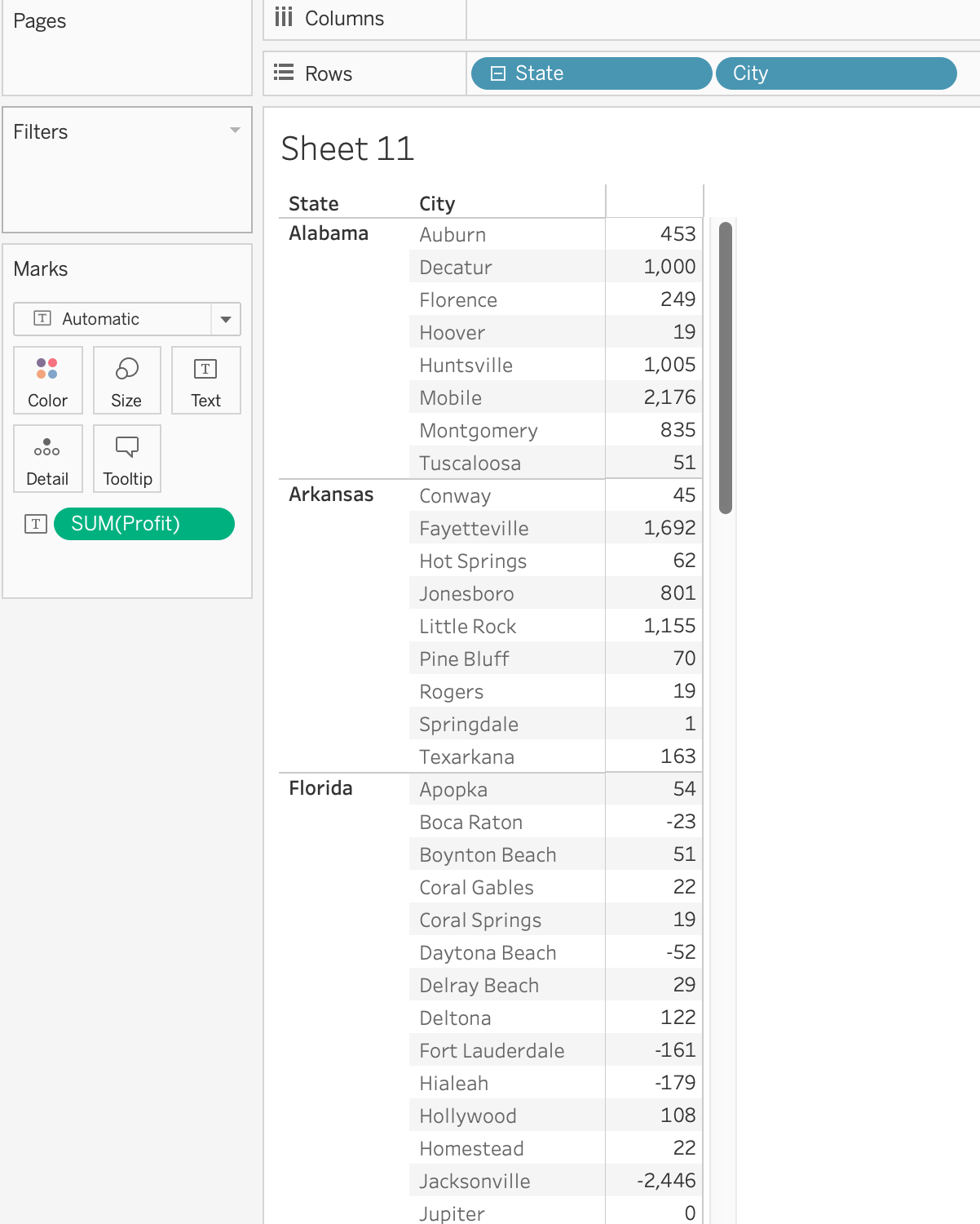
3) Organize dimensions into a hierarchy
- Hierarchy
: establishes a relationship between dimensions.
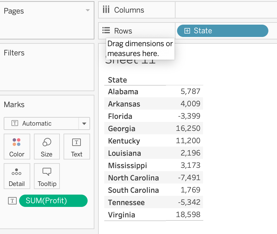
4) Add a filter to a view


- Filtering on an sum of profit (aggreate of a measure)
: at least sum of profit 50 ( = remove all of the products where the sum of profit is less than 50)
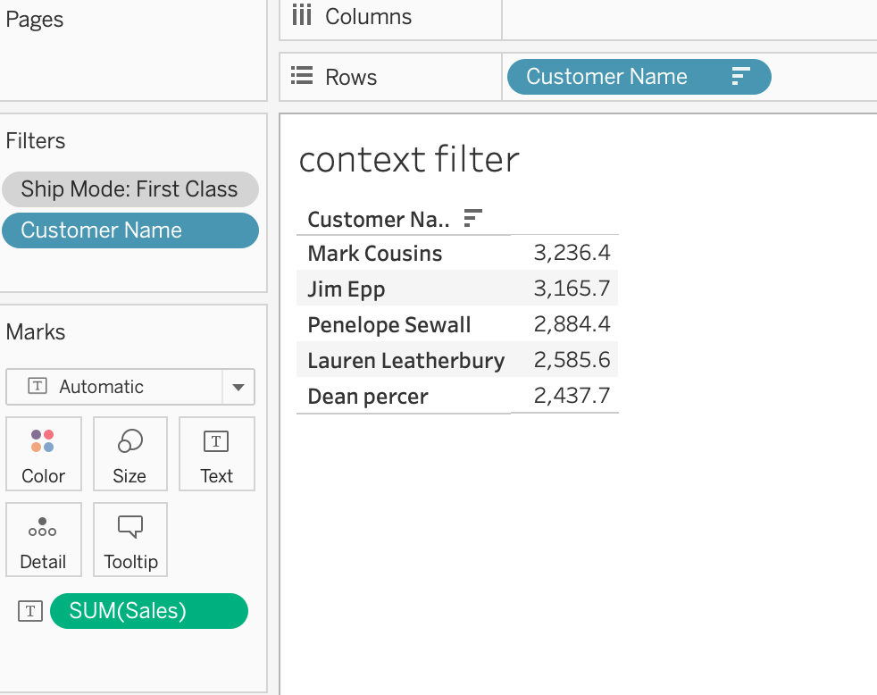
- Context Fileters
Context Fileters : By applying context filters, you can interactively control what data is included in your charts, graphs, and tables, making it easier to highlight specific insights or trends
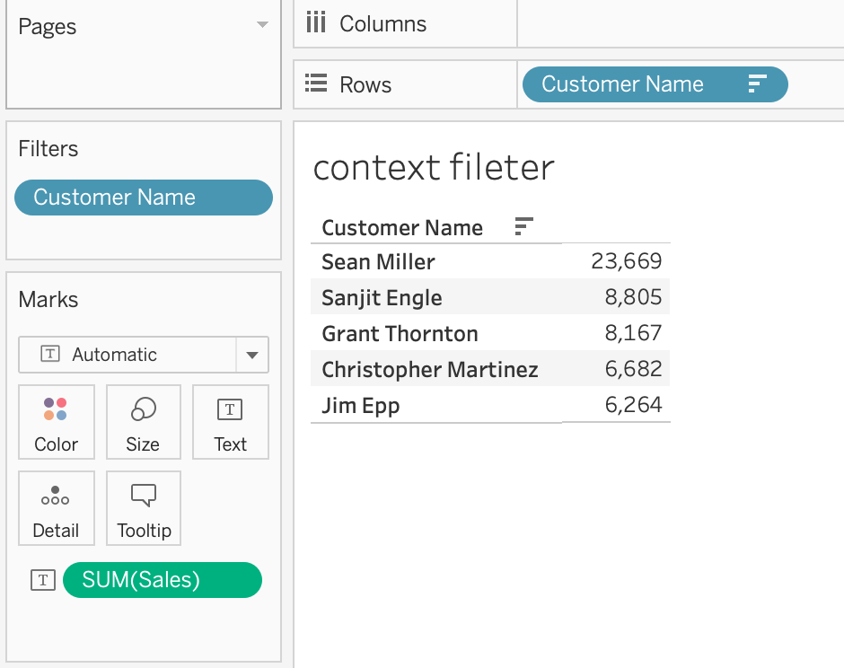

=> First Filter : Top 5 Customer by Sales
=> Second Filter : Ship Mode : First Class
Q) 2개의 필터 이후 한명의 승객만 보여지는 이유?
: 첫번째 (Top 5 Customers) 필터가 두번째 필터(dimension filter = 'Ship Mode: first class') 보다 먼저 실행되었기 때문이다
< Order of Operation in Tableau >
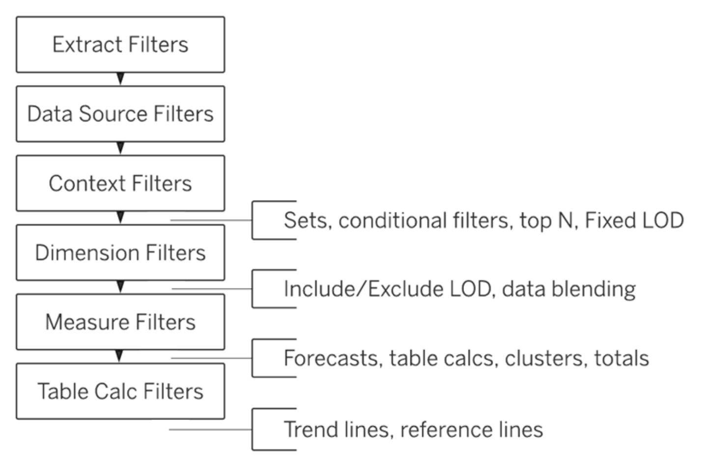
[ Solution ]
만약 Ship Mode: first class내의 Top 5 Customers를 표시하고 싶은 경우
두번째 필터(dimension filter)를 Context Filter로 변경한다.

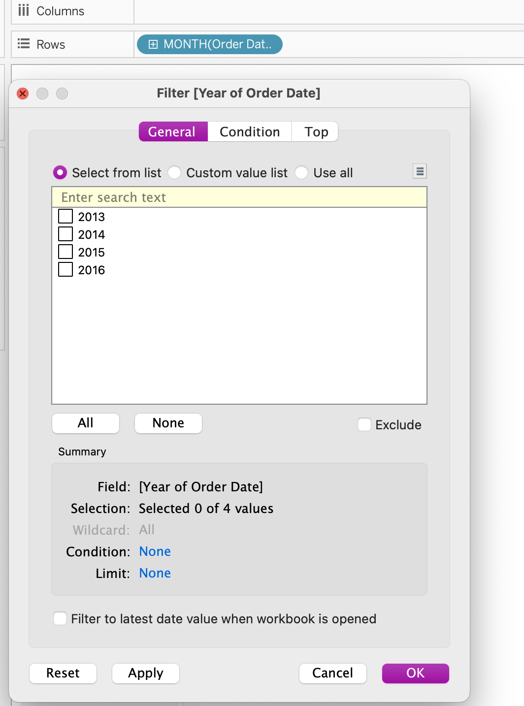
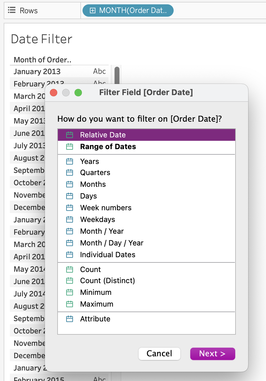
5) Add a date filter
2.3 Apply analytics to a worksheet
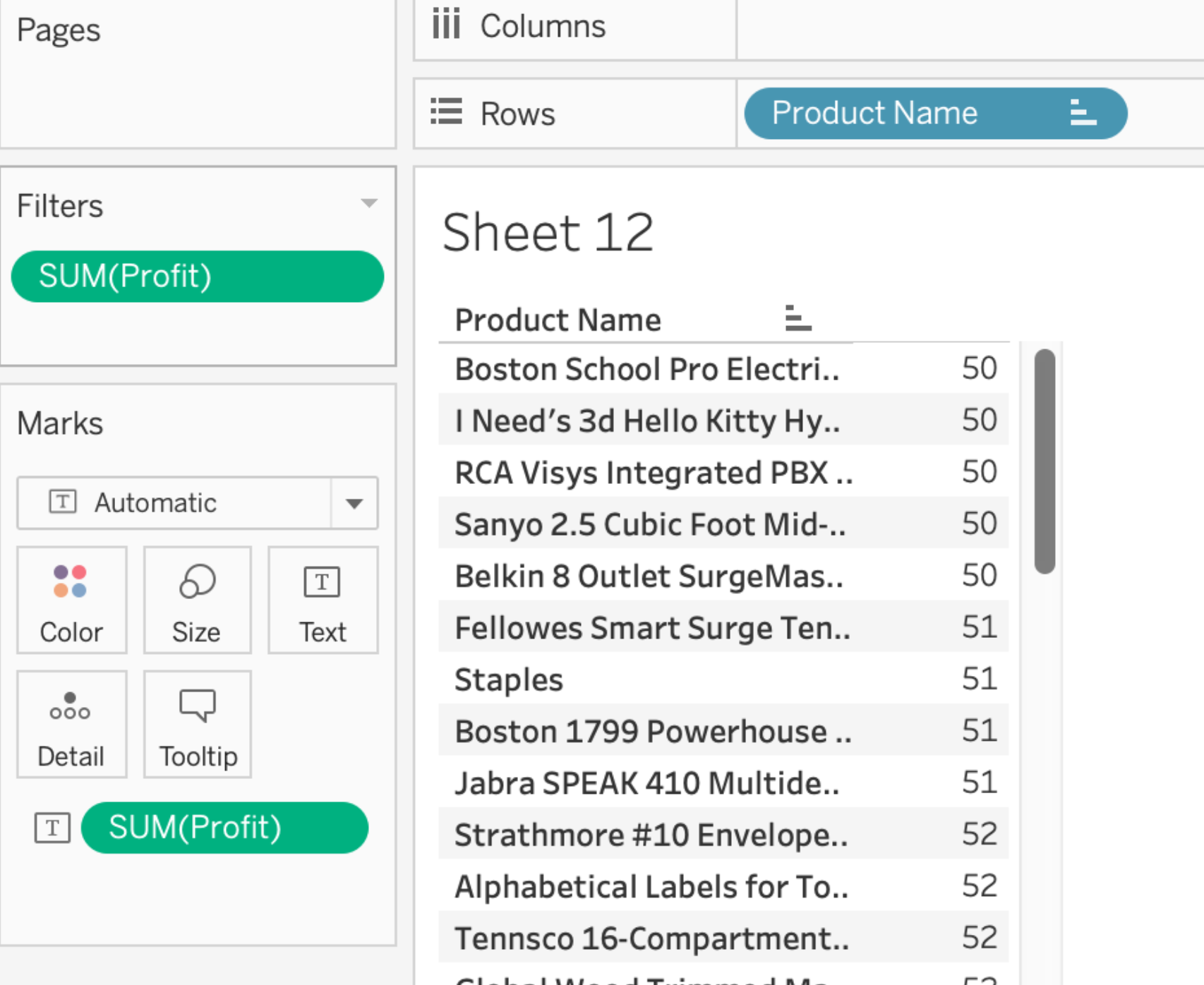
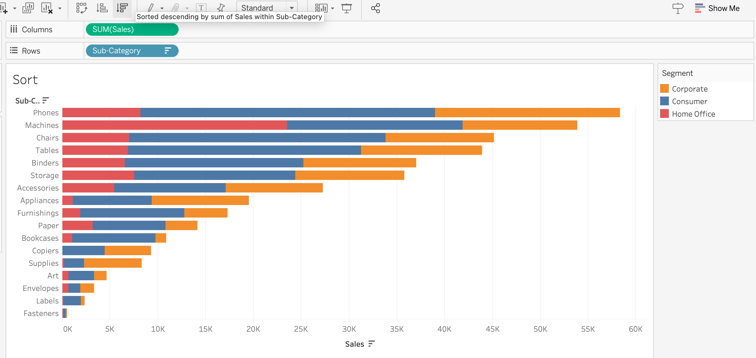
1) Add a manual or a computed sort
- manual sort : just drag and drop
- computed sort
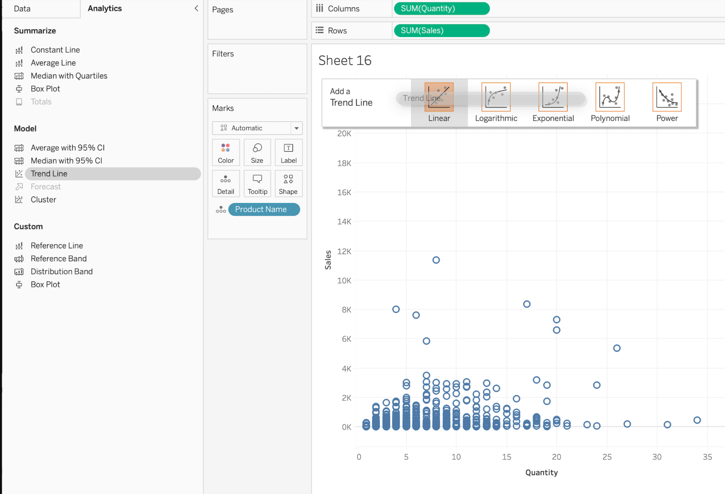
2) Add a reference line
reference line : used in visualizations to represent important reference points or comparison targets.
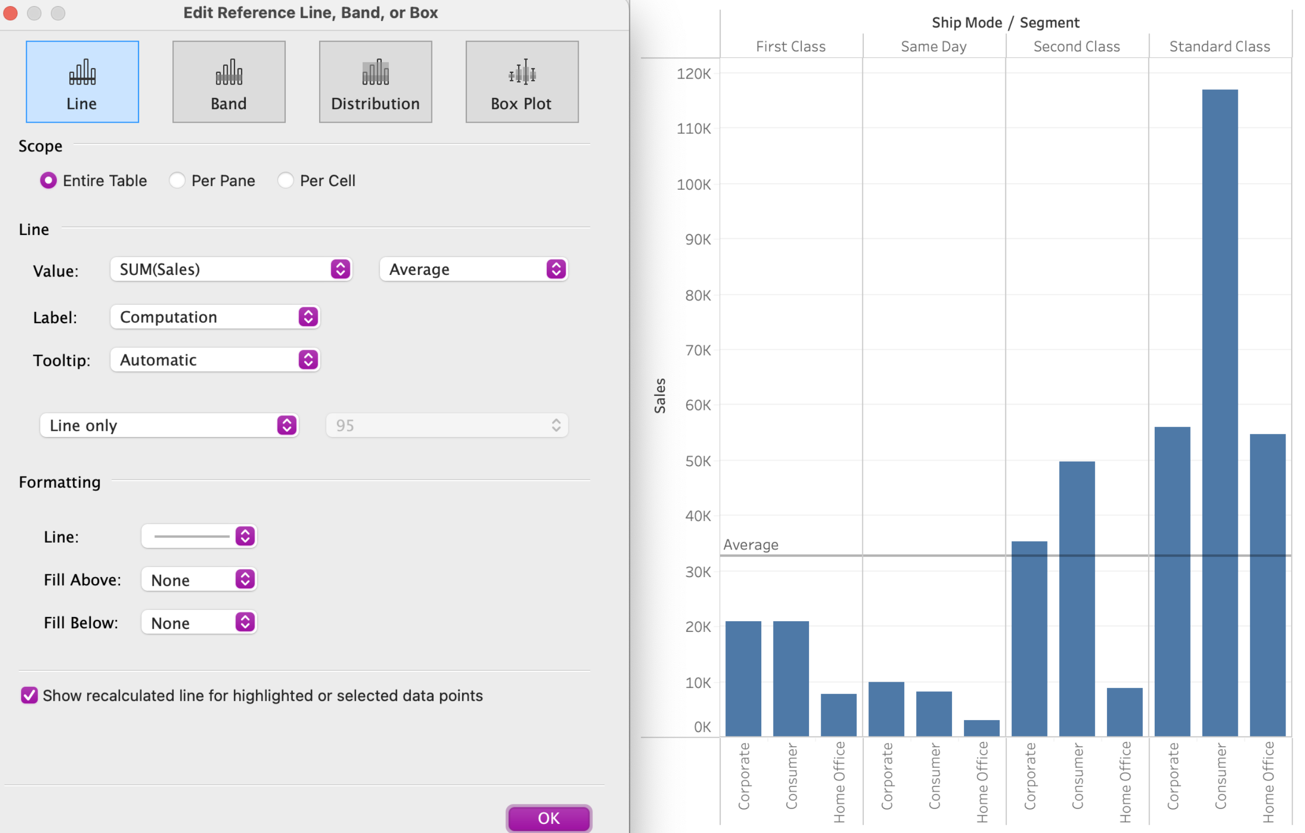
- trend line
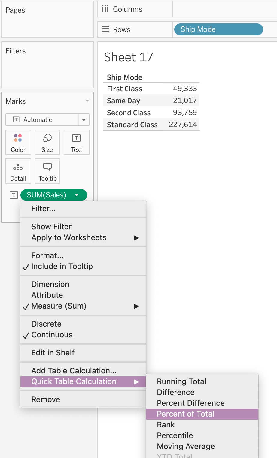
3) Use a quick table calculation
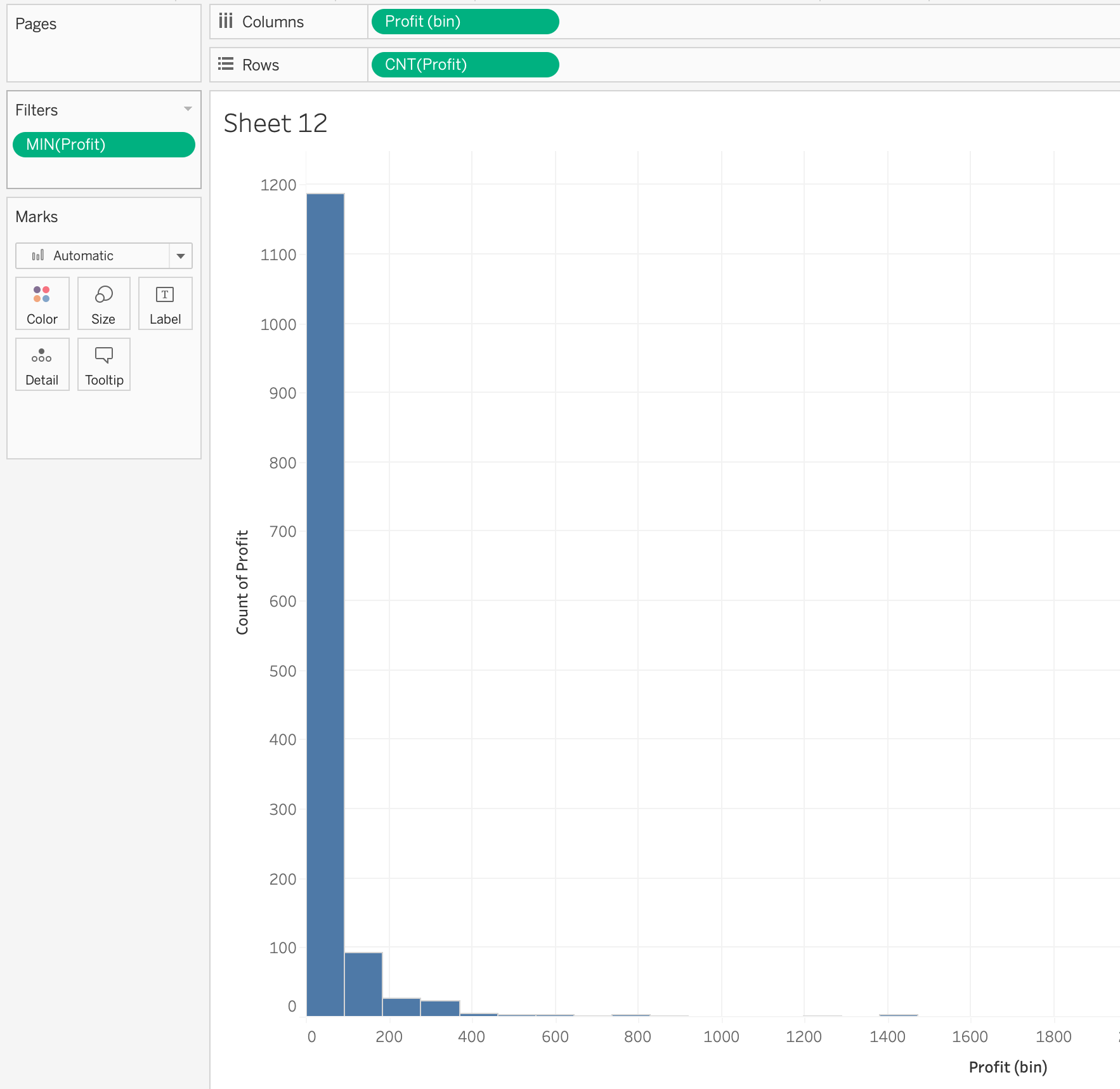
4) Use bins and histograms

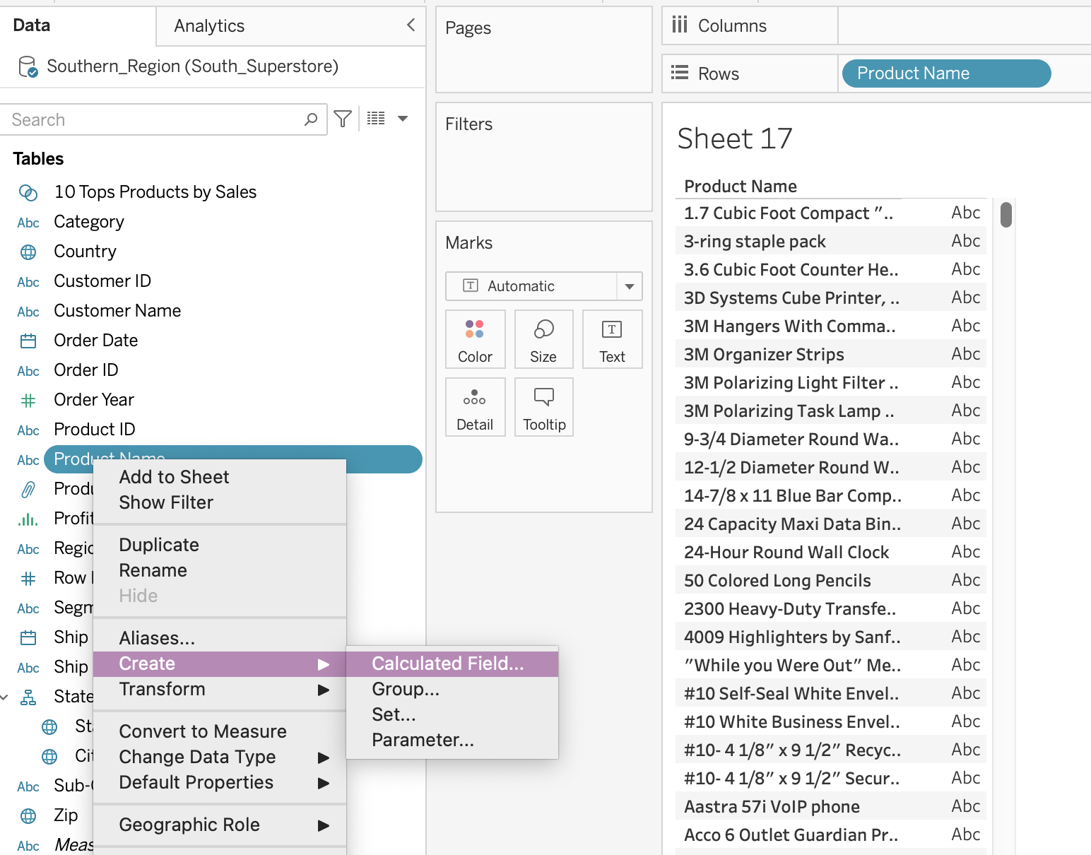
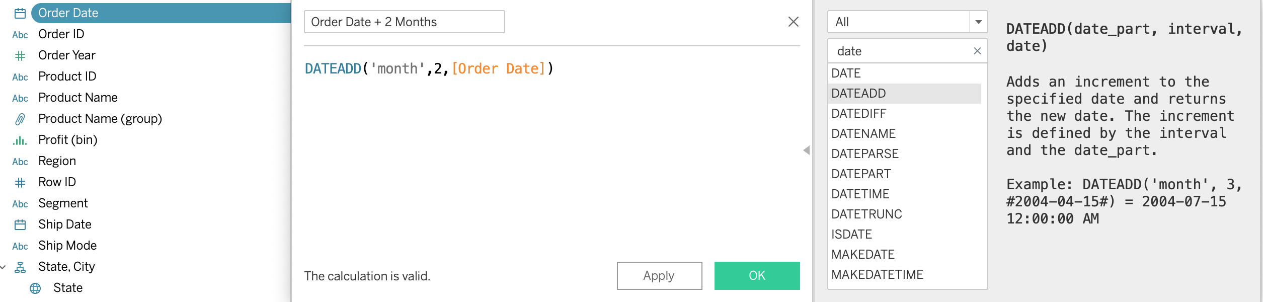
5) Create a calculated field (e.g. string, date, simple arithmetic)
- string calculation

- date calculation
: add 2 months to 'Order Date'
6) Explain when to use a parameter
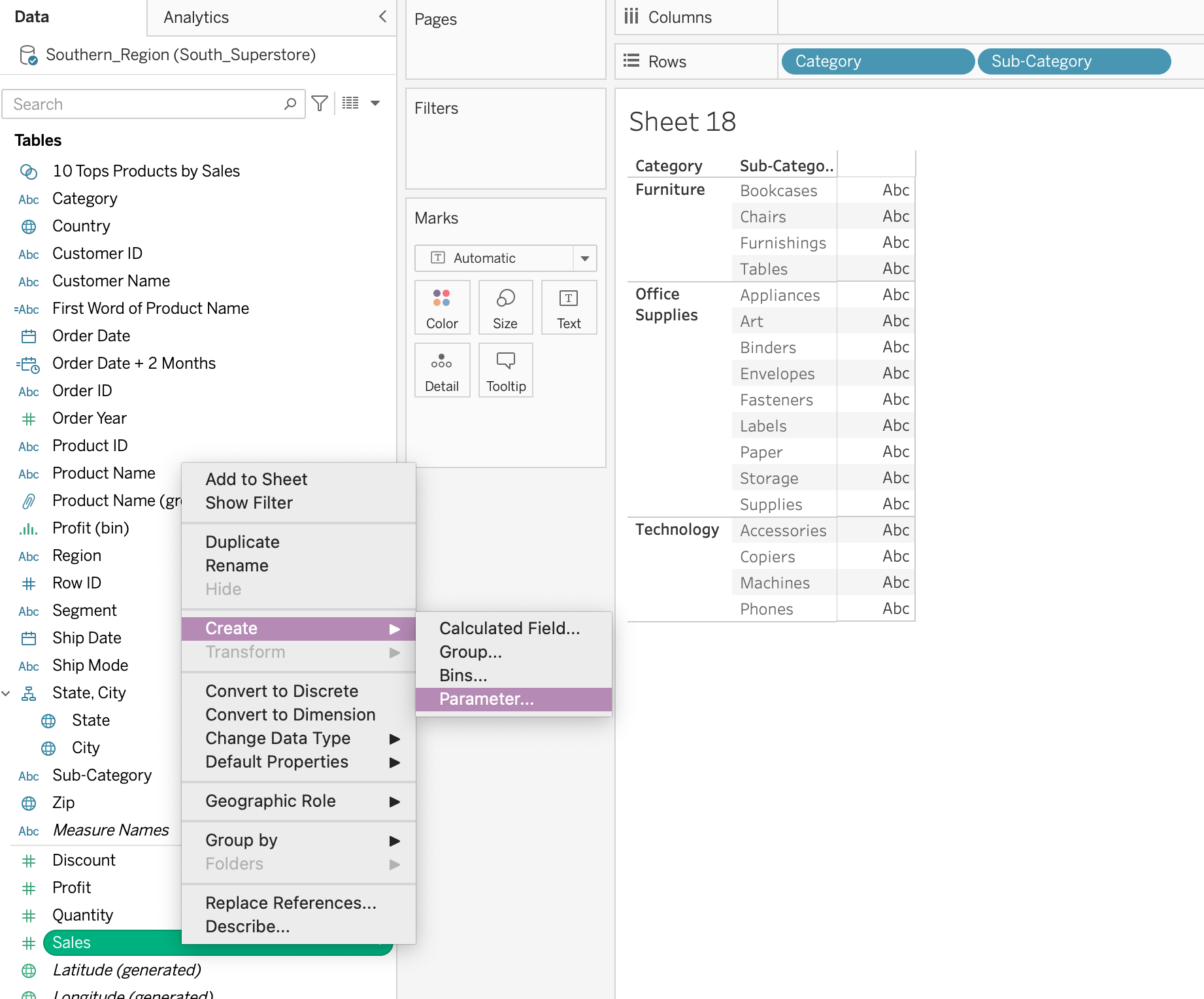
- In a view showing the top customers, allow the users to show how many customers to show
- Allow the worksheet viewer to adjust the bin size for a histogram
- the user to be able to choose to have other measures shown in the same format
* Simply adding a parameter will not change the view. You'd need to use the parameter as part of a calculation or filter to change the view.
=> parameter : 사용자가 대시보드나 워크시트 내에서 값을 선택하거나 입력할 수 있는 동적인 설정 요소
- parameter (= 변수) : 상수값으로 대체 가능한 숫자, 날짜, 그리고 문자열을 변수화해서 사용 ( true/false값 반환 )
- 계산식 활용 가능
- filtering 가능
(날짜 범위를 선택하거나 특정 카테고리를 선택할 때 매개변수를 활용하여 데이터를 동적으로 필터링)
- 대시보드에 제어 요소 추가
(사용자 인터페이스 요소(예: 드롭다운 목록, 슬라이더)를 추가)
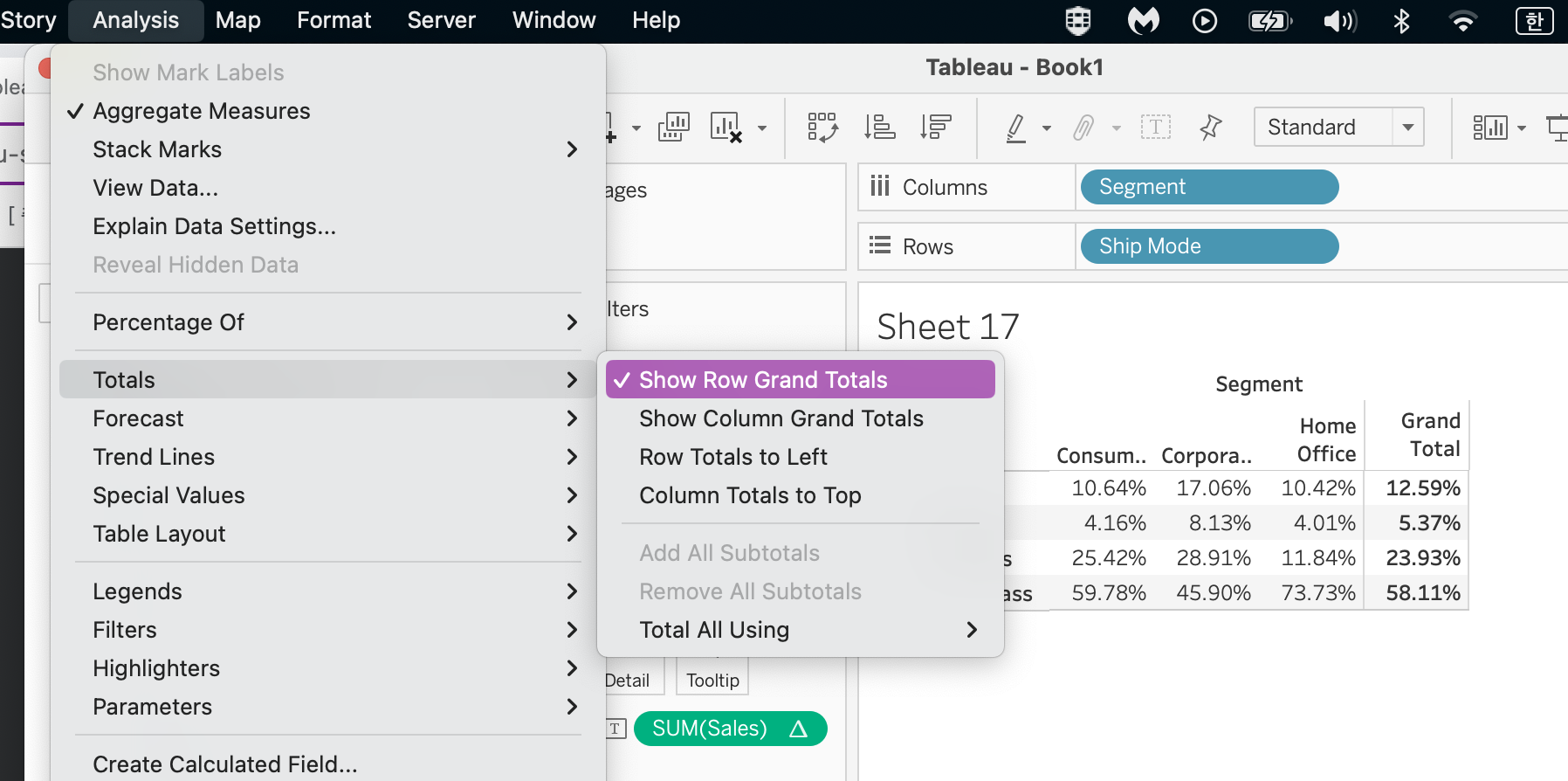
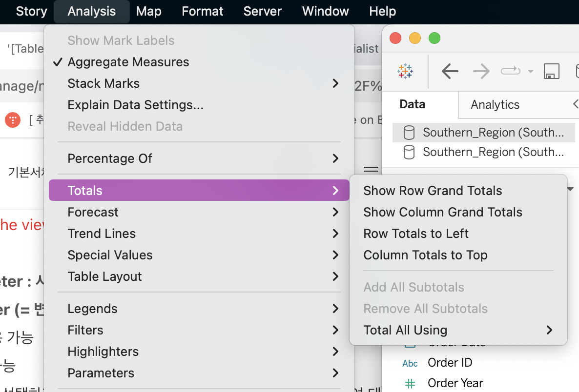
7) Display totals on a worksheet
- How to add totals to the view below:
1) On the Analysis pane, drag Totals into the view and drop on the Row Grand Totals area
2) Select the Analysis option on the toolbar, then Totals and Add Row Grand Total
reference : https://www.udemy.com/course/tableau-specialist-certification-prep/


